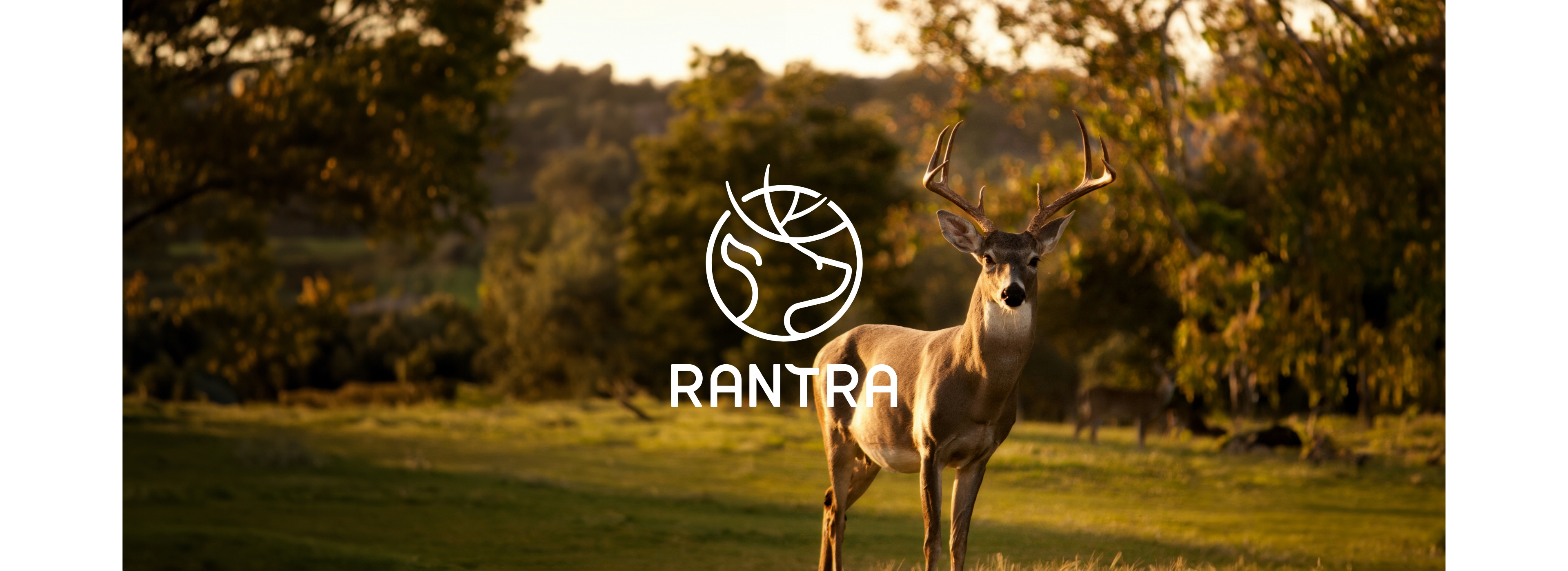
Rantra is a blend of "Ranger" and "Natura," symbolizing a lifestyle that connects nature with human values. The brand's culture promotes enjoying outdoor life and living in the moment. Rantra is not just a provider of outdoor gear but a proponent of a joyful lifestyle.
The brand embodies a spirit of freedom, adventure, youthfulness, and intelligence, encouraging people to embrace life and nature at every moment.
- Project
- Rantra
- Project Services
- Identification design
- Year
- 2023
"Rantra: The Union of Rangers and Nature"
Brand Concept Development
The deer symbolizes freedom, adventure, and strength, much like explorers who challenge their limits and live free lives.
As a forest guardian, the deer also represents Rantra's strong and wild character.
As a forest guardian, the deer also represents Rantra's strong and wild character.
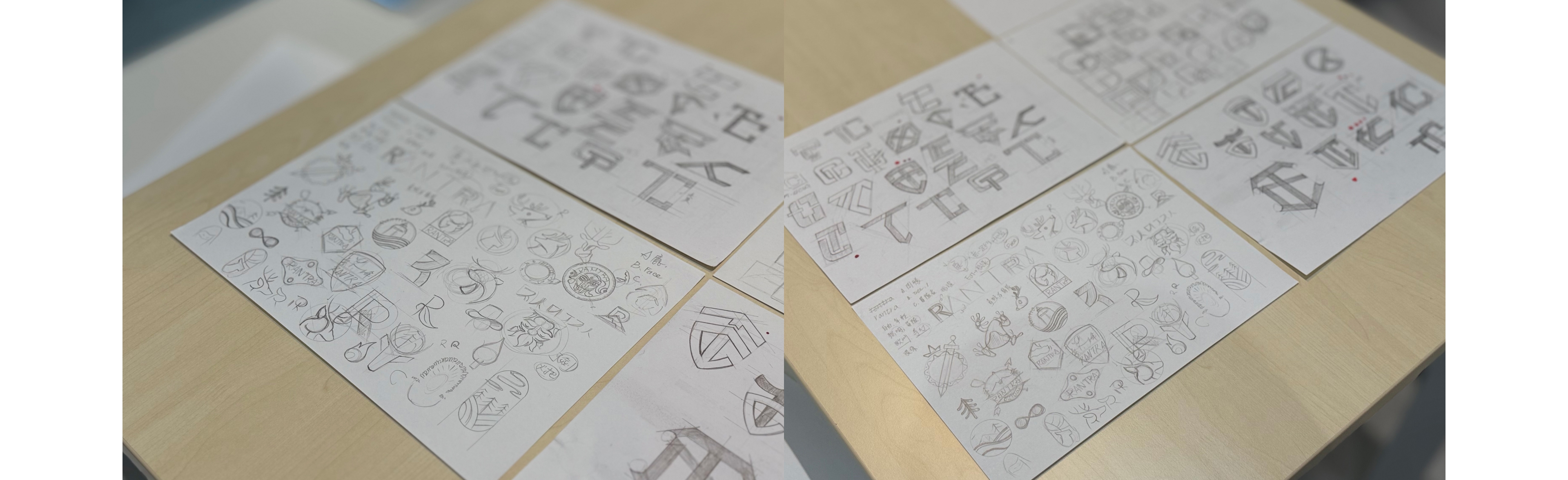 ▴ Sketch Ideas
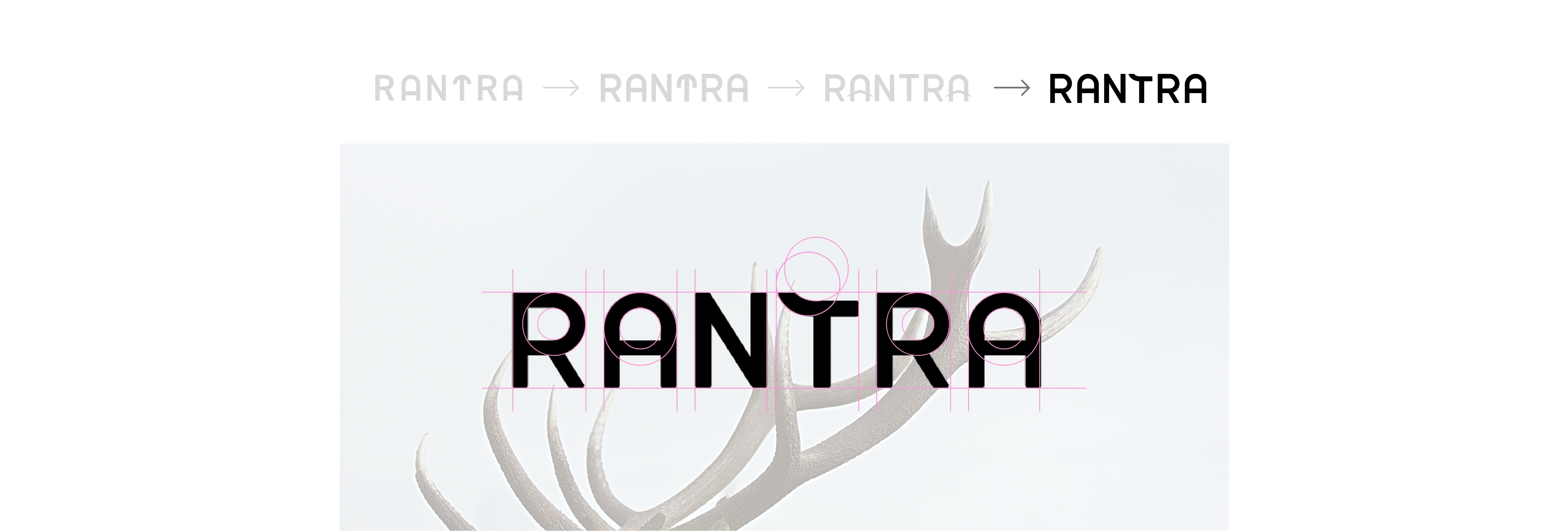
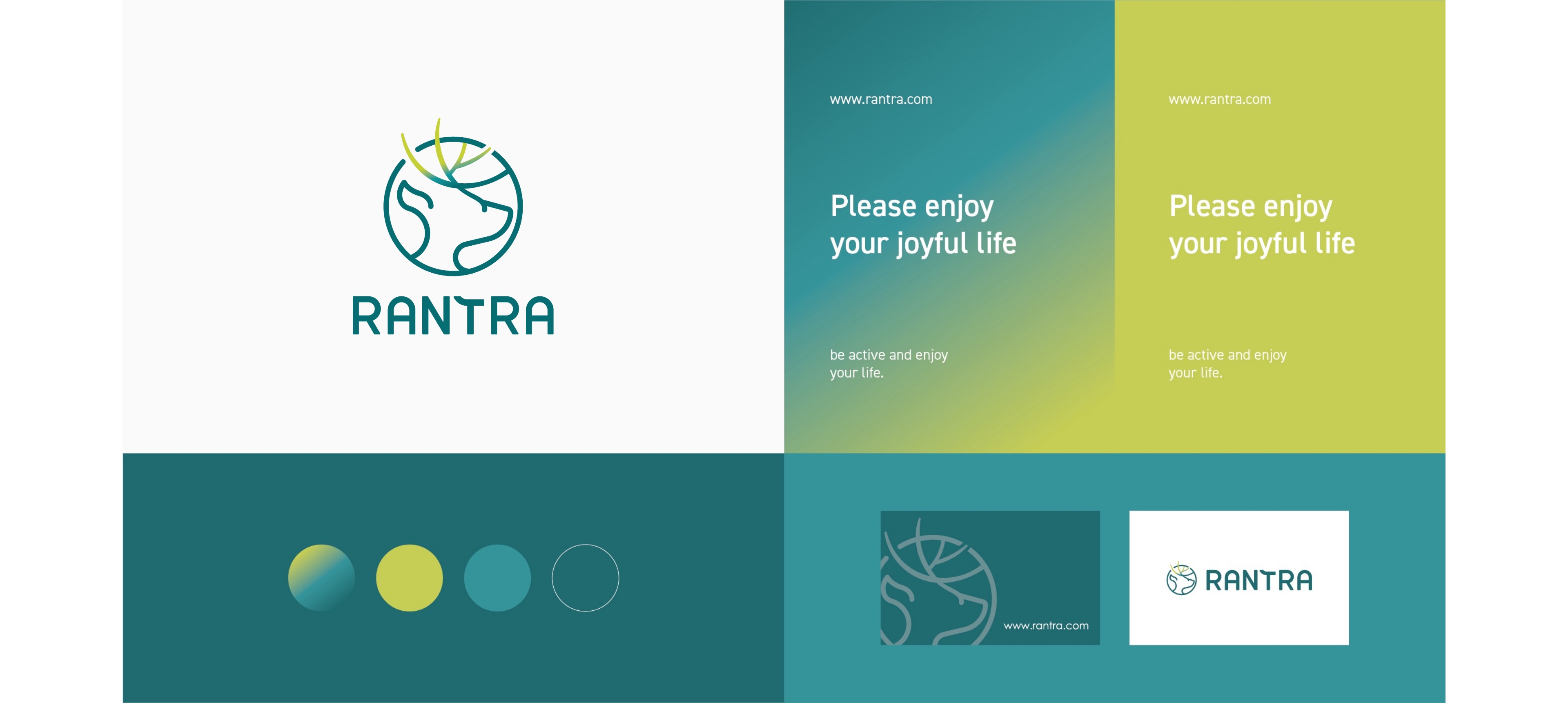
▴ Logo Evolution Process

Rantra = Ranger (adventurer) + Natura (nature)
In the design of the logo, the prominent interwoven deer antlers emphasize breaking through boundaries
and express the brand’s open and untamed character. The proportions are arranged to enhance the visual impact.
The standard lettering draws inspiration from the shape of antlers, symbolizing adventurers exploring the world and setting up camp in the wilderness.

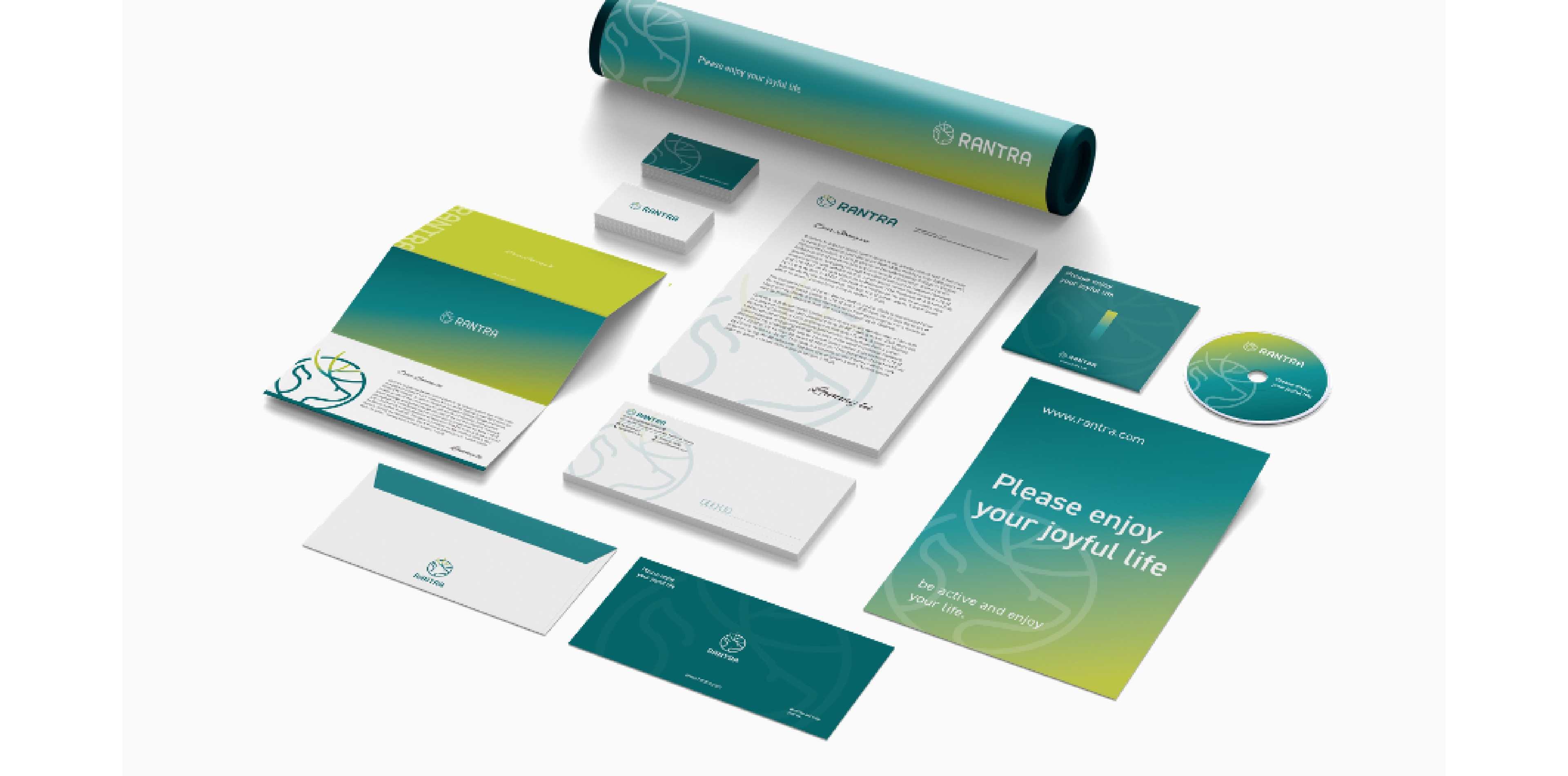
▴ Brand Elements
Brand Identity Finalization
▴ Final Brand Identity Decision
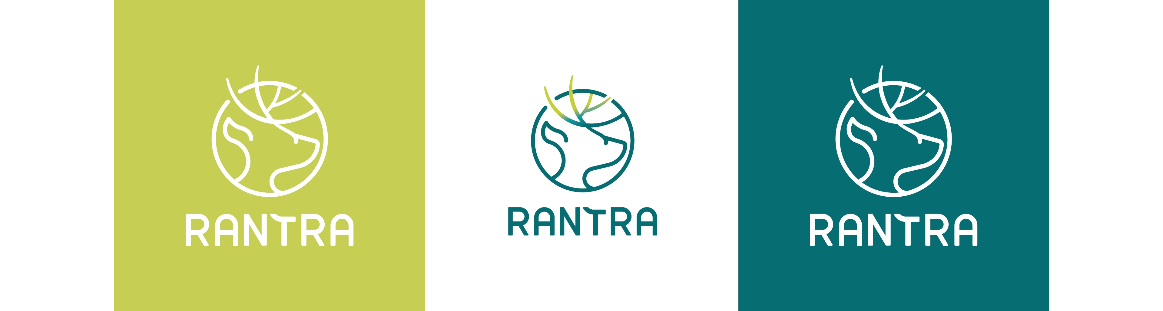
Brand Color Plan
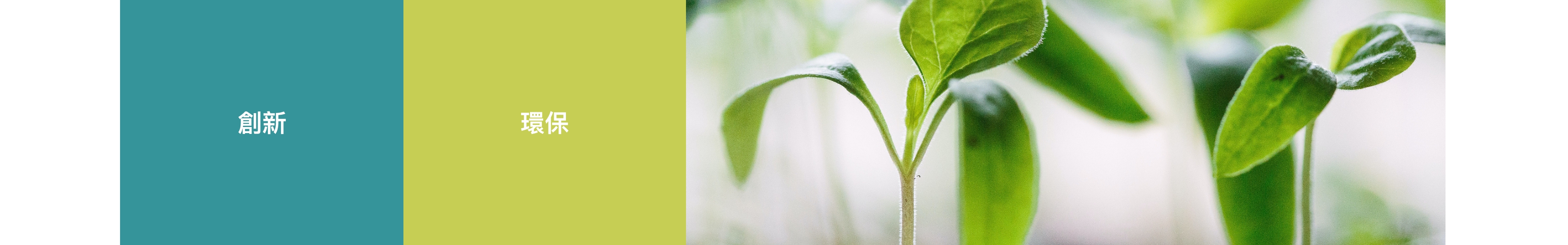
The overall color scheme of the brand identity uses shades of green as the primary color.
The gradient applied to the antlers represents growth and continuity, symbolizing the brand's focus on environmental sustainability
and its commitment to caring for the environment. This also reflects the brand's spirit of vitality and innovative energy.
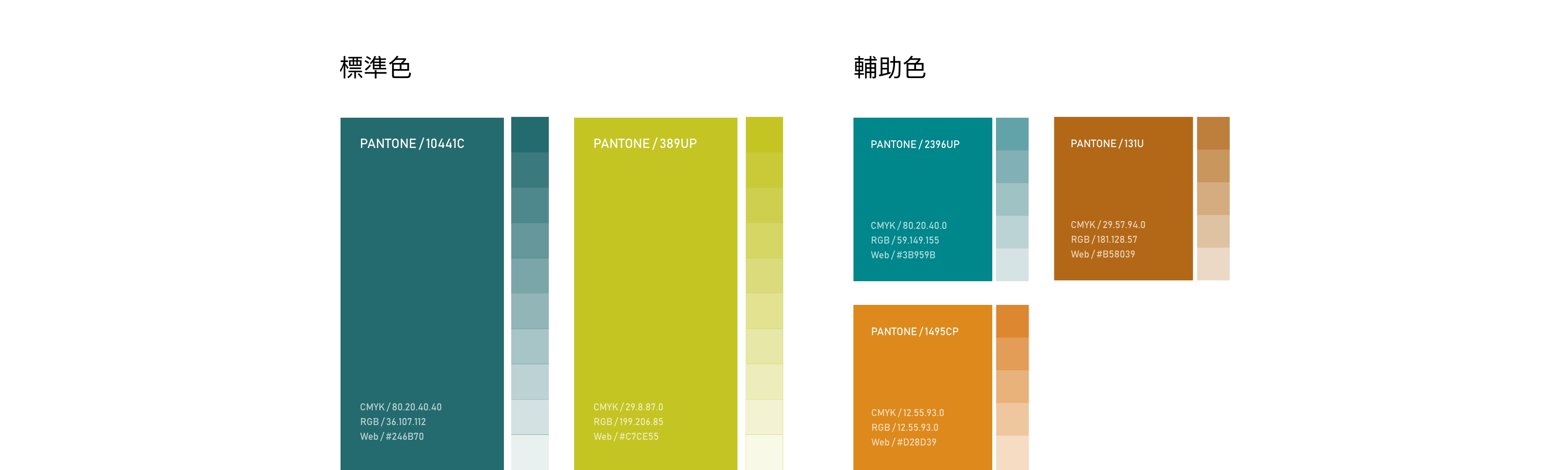
▴ Final Color Plan Decision